Editor’s Note
At Decor Your Room, we believe that choosing colors shouldn’t be stressful. A great color palette is the foundation of a beautiful home. This guide will show you the professional secrets to mixing colors like a pro, even if you have no design experience!
The Power of Color
Have you ever walked into a room and felt like everything just “fits” perfectly? That is the power of a good color palette. Knowing how to create a color palette for your home is the first and most important step in decorating.
Many people pick colors one by one. People often purchase a couch in one shade, drapes in another, and a carpet in a third, only to find that none of them actually look good together. Often, these colors fight with each other. A professional palette makes sure that every room in your house feels connected and peaceful.
Within this post, we are going to simplify the entire method into easy-to-follow instructions. We will learn about the 60-30-10 rule and how to pick colors that reflect your personality. Let’s start turning your house into a designer home!
Find Your Inspiration First
Don’t start by looking at paint buckets. Start by looking at things you love. It could be a piece of art, a colorful rug, or even a beautiful photo of nature. Look at the colors in that object.
Usually, you will find one main color and a few smaller colors that look good with it. Use these as your starting point. This ensures that your home reflects your personal style right from the beginning.

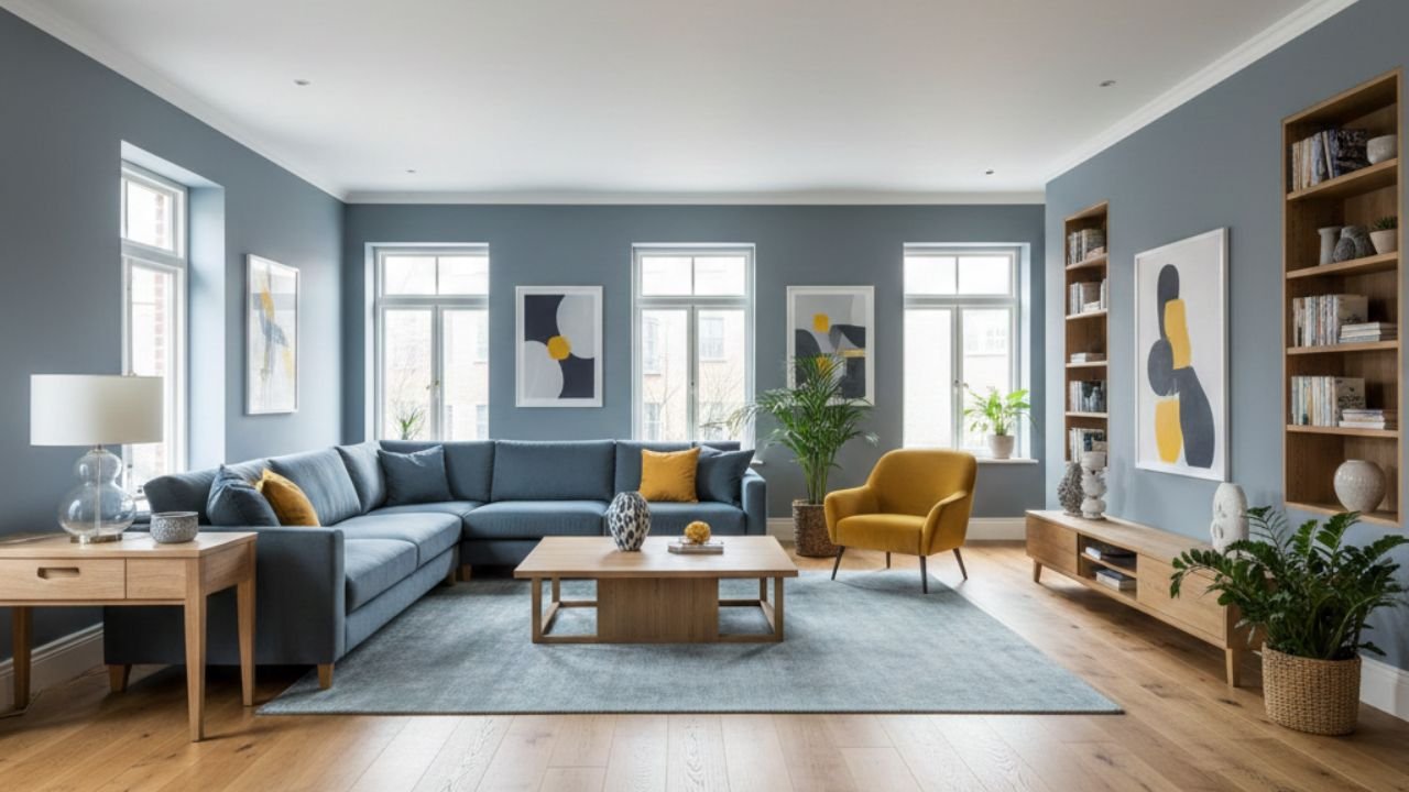
Understand the 60-30-10 Rule
This is the most important “secret” of interior designers. To keep a room balanced, you should use three colors in these amounts:
60% Main Color: Usually a neutral color for walls and large furniture.
30% Secondary Color: A bolder color for chairs, curtains, or an accent wall.
10% Accent Color: A bright or “pop” color for cushions, art, and small decor.
This rule prevents a room from looking too messy or too boring. It creates a perfect visual balance that is easy on the eyes.

Start with the “Whole-House” Neutral
To make your home feel connected, choose one neutral color (like soft white, beige, or light grey) for the main areas. Use this color in the hallways and living room.
When the main areas have the same neutral color, you can change the accent colors in different rooms. This makes the transition from the kitchen to the bedroom feel smooth and natural.
Use the Color Wheel
You don’t need to be an artist to use a color wheel. For a safe look, pick colors that are next to each other (like blue and green). This is called an “Analogous” palette.
If you want something bold, pick colors opposite each other (like blue and orange). This is called a “Complementary” palette. Using the wheel helps you understand why some colors just look “right” together.

Consider the Mood of Each Room
Colors change how we feel. Blue and green are calming, so they are great for bedrooms. Red and yellow are high-energy, so they work well in kitchens or dining areas.
Think about the vibe you want for your space first; once you decide on the emotional feel, selecting the right shades becomes a very simple task.

Test Your Colors in Different Light
Pro Tip: Never buy paint after looking at a small paper sample in the store. Paint colors look different under sunlight than they do under your home’s lamps.
Buy small sample pots and paint a square on your wall. Look at it in the morning, afternoon, and at night. This prevents you from making an expensive mistake with a color you might hate later.

Add Texture as a “Color”
Sometimes, you don’t need a new color; you need a new texture. Wood, leather, and metal act as colors in your palette. A brown wooden table adds warmth just like a tan paint color would.
When planning your palette, think about the materials in your room. If you have a lot of dark wood, your paint colors should be light to balance it out.

The “Odd Man Out” Strategy
Every perfect palette needs one “odd” color to keep it interesting. If your room is all white and grey, add one small black or gold item.
This tiny bit of contrast makes the whole room look intentional and professional. It stops the room from looking like a boring furniture catalog.

Don’t Forget the Flooring
Think of your flooring as another wall in the room; whether it is timber, stone, or rug, your wall paint needs to complement the surface beneath your feet.
If your floor is very dark, light walls will make the room feel open. If your floor is light, you can afford to go a bit darker on the walls for a cozy feel.

Why Your Perfect Palette Might Look “Off” at Night
The most common mistake homeowners make is choosing a professional color palette but ignoring their light bulbs. Colors are ‘chameleons’; they change based on the light hitting them. If you have chosen a cool-toned palette (Blues, Greys, Whites), using a very yellow light bulb (2700K) will make your walls look muddy or greenish.
Conversely, if you have a warm palette (Terracotta, Beige, Gold), a cool daylight bulb (5000K) will make the room feel clinical and cold. For a truly professional look, match your bulb temperature to your palette: use ‘Neutral White’ (3000K to 3500K) bulbs to keep your chosen colors looking true to their original tone both day and nigh

Keep it Simple
The biggest mistake beginners make is trying to use too many colors. Stick to a maximum of 3 to 5 colors for your entire house.
Check our guide on the Best lighting for a small living room to see how light bulbs can transform your chosen colors.
A limited palette makes your home look expensive and well-planned. It also makes shopping for new furniture much easier because you already know which colors will fit!

FAQs
Which paint shades work most effectively for compact living spaces?
Light neutrals like off-white or very light grey are best as they reflect light and make the space feel bigger.
Is it possible to incorporate deep or moody tones into a tiny area?
Yes, if you use them as a 10% accent or on just one wall to create depth.
How do I pick colors that don’t clash?
Use the 60-30-10 rule and stay within the same “temperature” (either all warm colors or all cool colors).
Conclusion
Creating the best color palette for your home is not just about following fashion trends; it is about making your space feel like yours. When you use the 60-30-10 rule and take the time to test your paint samples in different lights, you remove the guesswork. You no longer have to worry if your new rug will match your walls you will already have a plan.
Remember, the most beautiful homes are the ones that feel balanced and intentional. Start with one room, find your inspiration, and slowly build a color story that flows through your entire house. Don’t be afraid to make mistakes, paint can always be changed but with these professional tips, you are much more likely to get it right the first time. Happy decorating!