
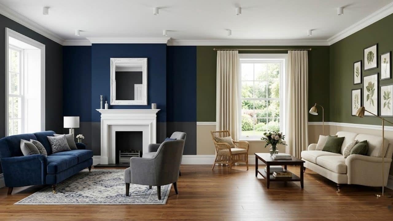
Editor’s Note
At decoryourroom.com, we firmly believe that your drawing room is the ultimate reflection of your home’s personality. Unlike private sleeping quarters, this is your primary entertainment zone, the space where you host guests, celebrate milestones, and make lasting first impressions. Selecting the correct wall hue is the single most impactful design decision you will make. The wrong shade can make a massive room feel cramped and unwelcoming, while the perfect palette can instantly elevate basic furniture into a high-end showcase. In this comprehensive guide, we are breaking away from boring, outdated neutrals and exploring the most trending, sophisticated paint colours for drawing room layouts to help you curate a truly unforgettable aesthetic.
Introduction: Why Drawing Room Colors Matter
The psychological impact of color within formal seating areas is profound. When visitors step into your house, their brains immediately process the ambient hues, subtly influencing their mood and comfort levels.
A drawing room requires a delicate chromatic balance. It must feel impressive and upscale, yet remain warm and inviting enough to encourage long, relaxed conversations. Gone are the days when slapping a coat of stark, sterile white paint was considered acceptable.
Today’s interior design landscape favors intentionality. Whether you are aiming for the moody sophistication of a luxury bachelor pad or a vibrant, eclectic family gathering space, mastering
Your color palette is the foundational step. Let us explore the top trending shades currently dominating the architectural world.
Trending Two-Colour Combinations for Modern Drawing Rooms
Why settle for a single shade when you can create dynamic contrast? Dual-tone walls add immense architectural depth without requiring expensive renovations.
The Classic Navy and Crisp White
Pairing a deep, saturated navy blue with stark, bright white is a timeless strategy that never loses its luxurious appeal. Apply the navy to the lower half of your walls (ideally below a chair rail) and paint the upper half white. This grounds the room while keeping the ceiling visually elevated and airy.
Soft Sage Green and Warm Beige
If you want to introduce a calming, organic atmosphere, this combination is flawless. Sage green acts as a subtle nod to nature, pairing beautifully with earthy beige tones. This aesthetic works exceptionally well if you plan to incorporate natural light and a custom built-in window seat into your layout.
Earthy Tones: Bringing the Outdoors Inside
The biophilic design movement continues to dominate home styling. By drawing inspiration from the natural world outside, you can establish a deeply grounding and serene environment indoors.
Terracotta and Baked Clay
Warm terracotta shades inject instant energy and hospitality into formal seating areas. These baked, earthy reds evoke the charm of Mediterranean villas. They look spectacularly rich when illuminated by warm evening lamps and pair brilliantly with heavy, textured linen curtains.

Deep Forest Green
For a more dramatic, moody vibe, dark forest green is an unmatched choice. It serves as a breathtaking backdrop for metallic accents, particularly polished brass or brushed gold lighting fixtures. This shade provides an incredibly opulent, velvet-like finish to your walls.

The Psychology of Warm vs. Cool Tones
Understanding color temperature is vital before you commit to purchasing gallons of paint. The undertones dictate the entire emotional frequency of your room.
Energizing Warm Hues
Colors with red, yellow, or orange undertones physically stimulate the room. Soft mustard yellows or muted peaches draw the walls inward, making massive, cavernous drawing rooms feel instantly cozier and more intimate for intimate gatherings.
Expansive Cool Shades
Conversely, cool tones like icy blues, soft lavenders, and slate greys recede visually. If your drawing room suffers from limited square footage, applying a pale, cool-toned gray will trick the human eye, expanding the perceived boundaries of the space and making it feel much larger.
How Natural and Artificial Lighting Alters Paint Color
The most beautiful paint swatch in the hardware store can look entirely different once applied to your specific walls. Lighting is the ultimate wild card in interior design.
Assessing Natural Sunlight
Rooms facing north receive cool, bluish daylight that can make gray paints look incredibly sterile and chilly. You must counteract this by choosing shades with warm undertones. South-facing rooms, however, are flooded with intense, warm light, allowing you to successfully pull off darker, cooler colors without the room feeling like a cave.

The Impact of Artificial Bulbs
Never finalize a paint choice without testing it under your room’s actual light fixtures at night. Warm LED bulbs (around 2700K) will enhance yellows and reds but might muddy your pristine blues. Always paint a large test square and observe it at 10 AM, 3 PM, and 8 PM before making a final commitment.
Vastu and Feng Shui Compliant Colors for Positive Energy
Many homeowners prefer to align their aesthetic choices with ancient spatial philosophies to guarantee a harmonious flow of energy.
Vastu Shastra Recommendations
According to Vastu, the drawing room should ideally be located in the north-west or east direction. Soft yellows, pale greens, and light blues are highly recommended to promote joy, prosperity, and peaceful interactions among guests.

Feng Shui Considerations
In Feng Shui, the living and drawing areas are associated with the Earth element. Incorporating gentle sandy browns, soft taupe, or even subtle buttery yellows helps to stabilize the energy of the home, creating a safe, welcoming haven for visitors.
Choosing the Right Finish: Matte, Satin, or Gloss?
Selecting the perfect hue is only half the battle. The sheen or gloss level determines both the final look and the durability of your walls.

The Elegance of Flat/Matte
A flat finish absorbs light entirely, hiding minor drywall imperfections and providing a rich, velvety appearance. It is highly recommended for low-traffic, formal drawing rooms or beautifully curated mid century bedroom designs. However, it is notoriously difficult to clean.
The Practicality of Eggshell and Satin
For a space that sees regular entertaining, eggshell or satin finishes are the industry standard. They possess a very subtle, elegant glow that bounces light around the room while offering a wipeable, scrub-friendly surface that resists scuffs and smudges.
Accent Walls: Are They Still in Style?
The concept of the accent wall has evolved. Randomly painting one wall a bright color is considered outdated, but strategic focal points remain highly relevant.
Textured Focal Points
Instead of just a different flat color, modern drawing rooms utilize textured accent walls. Think dark charcoal lime-wash, Venetian plaster, or deep-toned wood paneling behind the primary sofa. This adds tactile richness rather than just a jarring pop of color.

The “Color Drenching” Alternative
A massive rising trend is “color drenching” painting the walls, the baseboards, the doors, and sometimes even the ceiling in the exact same rich color. This erases visual boundaries and wraps the entire room in a sophisticated, uninterrupted blanket of color.

Professional Interior Designer Advice
As an architectural color consultant, the biggest disaster I witness is clients selecting their wall paint before buying their furniture. Paint is the most versatile and easily matched element in the entire room; there are thousands of distinct shades available. Conversely, that perfect velvet sofa or vintage Persian rug only comes in one color. Always choose your large investment pieces first. Once your fabrics and rugs are delivered, pull your paint swatches and find the hue that perfectly bridges those existing elements. Furthermore, always invest in premium, low-VOC (Volatile Organic Compounds) paints. They provide vastly superior coverage, richer pigmentation, and ensure your indoor air quality remains healthy for your family.
Conclusion
Curating the perfect paint colours for your drawing room is a transformative process that redefines your home’s entire atmosphere. By understanding the interaction between natural light and undertones, experimenting with sophisticated two-tone combinations, and selecting the correct sheen, you can create a space that feels both aggressively stylish and deeply welcoming. Whether you lean towards the calming influence of soft sage greens or the dramatic opulence of dark navy blues, your final choice should confidently reflect your personal taste and lifestyle.
FAQs
Which color is best for a small drawing room?
For compact spaces, soft, cool-toned neutrals are superior. Pale greys, icy blues, and soft lavender recede from the eye, creating an optical illusion that pushes the walls outward and makes the room feel much more expansive than its actual square footage.
Should drawing room colors be light or dark?
This depends entirely on your aesthetic goals. Light colors make a room feel airy, energetic, and open, which is excellent for daytime entertaining. Dark, saturated colors (like forest green or charcoal) create a moody, intimate, and highly luxurious environment, perfect for evening gatherings.
What is the most relaxing color for a formal living space?
Earthy greens and soft, muted blues are scientifically proven to lower heart rates and induce a sense of calm. These biophilic shades connect the human brain to natural outdoor environments, making them incredibly relaxing choices for sitting areas.